
When law and typography collide, it often is typography which is the loser. That is because many lawyers simply do not understand basics of printing and typography, with one of the most prominent areas of confusion being point size (perhaps followed closely by spacing). The multiplicity of definitions of point size (and in particular, why the Microsoft Word point size may not be the actual point size) is discussed in some detail by Butterick in Typography for Lawyers, an excerpt of which is at this link. This issue has, perhaps most notoriously, vexed the Supreme Court of Michigan in a case on type size, discussed in the aforementioned Butterick link. Stand Up for Democracy v. Sec’y of State (2012) 491 Mich 950; 815 NW 2nd 780
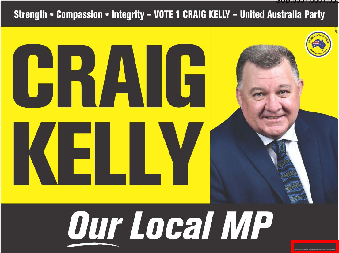
Now, in a recent case, Australian Electoral Com’n v Kelly [2023] FCA 854 the Federal Court of Australia has had a chance to consider type size. Mr Craig Kelly MP (UAP, Hughes) had produced a large number of corflute posters measuring 900mm by 600mm and 1200mm by 900mm. These featured the authorisation statement required by law in (what the judgment calls) eight point type size. The image of the poster below shows the scale of that authorisation statement (contained in the red box, which I have added to the image):

The issue in the case was (inter alia) if this poster was compliant with a Decision of the Australian Electoral Commission (AEC) which (so far as is relevant) provides that type must be ‘be reasonably prominent [and] be legible at a distance at which the communication is intended to be read’. ibid, para 10 The AEC relied on dictionary definitions to argue that prominence required ‘conspicuous’ authorisations that scaled with the size of the main text of the political material. They further argued that legibility was to be judged by the distance at which the poster was meant to be read (which in a large print poster could be considerable). ibid, paras 73–76
Rares J considered these two criterion in respective turn. While ‘prominent’ involves standing out, His Honour held the ‘reasonably’ qualifier, along with the fact that Parliament did not intend for the authorisation requirements to undermine freedom of political communication, meant merely that any voter seeking to know who authorised a piece of electoral material could reasonably ascertain that information. Thus, the small authorisation was prominent enough in the context of allowing someone inspecting the poster to know who authorised it, which was a distinct context to the dissemination of the poster’s message. ibid, paras 93–96 Consumer law was not relevant here, since the goals of consumer protection were quite different to the goals of requiring authorisation for electoral material. ibid, paras 97–100
Moving to legibility, Rares J noted that the meaning of ‘a distance at which the communication is intended to be read’ was far from clear. Posters can be viewed from a wide variety of distances (which is one of their utilities). Thus, the indefinite article ‘a’ in the requirement suggested to His Honour that there were multiple relevant intended distances, and that thus the legibility requirement would be satisfied if at any one of those distances the authorisation were legible. If one of those distances is a close distance, then legibility at that distance will do. ibid, paras 103–106 This requirement had nothing to do with relation in proportionality or size to any other text on the poster. ibid, para 111 It also was impossible to try to guess at legibility at all times of day or lighting conditions, both of which have substantial effect on legibility. Thus, the authorisation would be legible if it could be read in broad daylight at close distance. ibid, para 115
Thus, because the ordinary voter walking up to the poster could see the authorisation in the corner, it was reasonably prominent, and any other reading would interfere with the legislation’s purpose of allowing political material to be shown to electors with minimal interference. ibid, paras 116–118 As for legibility, His Honour cautioned against those who had viewed the posters in the Court from drawing to ready conclusions, because expert evidence hd correctly reminded them that legibility in natural light was a very different proposition to in the artificial light of a courtroom. ibid, paras 119–120 Imagining the example of seeing the poster on a school fence in daylight, His Honour concluded that someone walking past the poster would clearly see it as they moved past it in daylight, with the authorisation likely to be near eye level. ibid, para 123
In the opinion of your correspondent, His Honour got the decision right. Legibility and prominence are dynamic qualities, and interpreting the relevant legislation and Decisions in terms of a fixed scale with the size of poster text could lead to absurd or paradoxical results given the varieties of context in which electoral material is viewed. The authorisation may be tiny relative to the rest of the poster, but it can be easily located by any voter concerned about whether this material was properly authorised by the candidate’s agents. The only downside of the judgment is the uncritical use of ‘eight point type’ without ever considering the point that this may mean a number of different things. When considering type size cases, it is essential that judges and counsel remember that point size is not a cut-and-dried thing, because it is often used these days to refer to multiple things (see again Butterick, supra). This is a point worth hammering home.

© , Elijah Granet, but licensed to all under the terms of Creative Commons licence CC-BY-SA 4.0
Published by

GRANET PRESS
LIMITED


Comments
Post a Comment
Contributions are always welcome!