


The recent trend towards the greater publication of sentencing remarks is a boon to the analysis of legal style (as well as to open justice). The recent sentencing remarks of the Recorder of London, HHJ Lucraft KC (hereinafter, ‘the hon. judge’) in the murder case of R v Al-Jundi & El-Abboud, Sentencing Remarks of 1 February 2023 available at this link. provide an excellent opportunity for analysis. So it is that this publication returns to its bread and butter: Those who abstain from gluten are invited to insert their own metaphor here. close analysis of a published judicial act.
The image heading
The beginning of the sentencing remarks is deeply unpromising. We are greeted by a ‘logo’ which is meaningless and generic, takes up nearly the entire text-width, mistakes the name of the judiciary (it is HM Judiciary), reduces the Royal Arms to a barely visible afterthought, and by use of some variant (I believe) of Transport looks like a highway sign. Gentle reader, gaze upon it, if you dare:

This publication seeks to have a practical and tangible influence on legal style. Yet, here, my dear reader, your correspondent must confess that he may have inadvertently played some part in the creation of a great and profound evil, viz the header immediately above. Specifically, in a previous Note, I lamented the pixellated header of sentencing remarks, and re-mastered it to be more pleasing and worthy of the dignity of HM Judiciary. ‘At least use a high quality heading’, Note of 17 October 2022. Some time later, I sent a scrupulously polite e-mail to the web-masters of the judiciary.uk website, humbly suggesting they upgrade the image header, and offered as a template my own upgrade of the previous HM Judiciary heading. I received a polite acknowledgement in response, and, not long after, some (though not all) sentencing remarks began to use this monstrosity. Of course, it was not my intent that my correspondence should be a spur to worsening the heading. It did not occur to me for a moment that a suggestion to revise with an eye to amelioration a point of typography and design would be taken as a spur to make the worst possible decision. This was foolishly and inexcusably naïve of me to have such expectations of public typography. I beg the forgiveness of my readers for any rôle I may have played in this travesty, and I hope most fervently that I am being am exaggerating my own importance and the horrifying decision to use this heading was reached without consulting my input.
The title
The title of the case and sentencing remarks is given in bold, small-capitals:
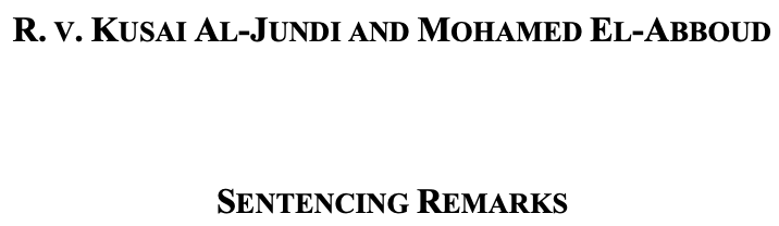
The general rule in typography is that double emphasis is to be avoided, because it distracts the reader. One form of emphasis (be it bold, small-capitals, or italic) is sufficient to get the attention of the reader. If extra importance is needed, it is better to increase the size of the text rather than to resort to double emphasis. There is also the problem that mixed small-capitals (lowercase and uppercase side by side), in particular, are unsuited to titles. They look ugly and unwieldy, and the variation in letter-height ruins any æsthetic niceness from small capitals alone. The best header would be simply italic, but bold alone would do as well. As it is, the long string of scrunched together (note the inadequate letter-spacing) small capitals is needlessly difficult to read and has the amateurish look of many poorly composed law journals (which often over-use bold small capitals). This is worsened by the fact that the small-capitals appear like the fake small-capitals done in Word, rather than a dedicated face (like might come with a professional cut of Times, such as Times Linotype, favoured by your correspondent). The giveaway is the height of the small-capitals, which is too high for true small-capitals, as well as their identical composition to the capital characters. Affine transformation is all well and good, but no amount of linear algebra can compensate for a separately cut small capitals face, as many fine typefaces (free and paid) have.
The title also makes use of closed punctuation (‘R.’ and ‘v.’). This is a legitimate practice, standard in many jurisdictions, but is generally deprecated in the UK for legal citations, and the standard is generally for open punctuation (‘R’ and ‘v’). The two defendants’ names are joined by the written out ‘and’, which is an error. Economy is paramount in case stylings, and therefore space ought to be saved by the judicious use of an ampersand.
The paragraph numbers
This is a very minor point, but the style of paragraph numbers in the remarks is sub-optimal:
As I have discussed before, ‘How to cite paragraphs: the simple answer’, Note of 28 October 2022. the correct way, to aid find and replace functions, to number paragraphs in the lining is in square brackets (so ‘[1]’). The Note linked in the preceding footnote explains this in greater detail.
Honorifics
The hon. judge quite rightly refers to the convicted defendants by the bare surname, without honorifics; as has been discussed previously in this publication, the convicted defendant is not entitled to the courtesy of an honorific. However, the hon. judge regretfully refers to the 71-year-old victim of the murderers throughout the judgment simply by her forename and surname, or, from para 11 onwards, by forename alone. The same is done for another victim of the murderers’ deceptions and a former girlfriend elsewhere in the judgment. This is, it is respectfully submitted, a grave error, most of all in respect of the victim. First, it is awkward and stilted to throughout use someone’s full name in any context, and reads like a circumlocution of employing honorifics rather than good style. Second, it is a matter of esteem and respect. The honorific shows that the court awards the victim dignity even in death, that it will give an honoured name and place to one whose life was stolen by the wicked acts of those in the dock. Finally, this is especially important when the victim was an elderly person, as to the older generations, these courtesies about honorifics and formality are often especially keenly felt (not least because they were once far more widespread outside in society). I have no personal knowledge of the deceased in this case, and would never presume to speculate as to what her preference would have been. However, generally speaking, it is true that while all appreciate courtesy, this appreciation is often more pronounced on those fine members of our community who are more advanced in years. As a sign of our respect to the deceased, we show concern for their wishes even when they are not among us, and such concern starts with how we invoke their names.
Must the judge sentence?
The final clause of the first paragraph reads ‘ I must now sentence the two of you.’ This point has come up previously in this publication, ‘On the sentencing remarks in R v Venables’, Note of 8 August 2022. but is worth re–emphasising: a judge should not risk giving the impression that the sentencing is something she does so out of hesitant obligation (no more than she should risk giving the impression she takes joy in the sentencing). A simple declarative statement conveys the point most elegantly: ‘I now sentence you’ or perhaps ‘I now pass sentence.’ Similarly, as there are two prisoners in the dock, the use of ‘two of you’ is unnecessary. The English ‘you’ is the second-person plural and there was no risk that absent a specific name reference people would confuse ‘you’ as referring to only one of the two defendants. Simplicity is often best.
Proper use of single quotation marks
Since at least Tschichold’s legendary rules of composition for Penguin, Typeset for your convenience by your correspondent and available at this link. the standard in British printing has been the use of the single quotation marks for outer quotation (eg, ‘example’). Yet, this is sadly often ignored by lawyers. The hon. judge is to be congratulated on the proper use of single quotation marks. At para 2
Commas and consistency
Most regrettably, the hon. judge generally forgot to apply the vocative comma to separate the invocation of a defendant’s name from the use of ‘you’. For example, ‘Al-Jundi you did[…]’ This is an error, as the vocative comma helps more clearly break up the text and guide the reader. This matter is somewhat personal to your correspondent, for whom the vocative comma is his favourite punctuation mark, but generally a sign of good writing. Phrases like ‘El-Abboud you drove Maria’ look wrong to the eye of a reader accompanied to the care and courtesy of a first class punctuated sentence. This is worsened by the frankly maddening inconsistency in the hon. judge’s writing, which in nearly consecutive sentences omits then employs the comma. This excerpt from para 19 is a case study in problematic comma inconsistency:
Al-Jundi you are aged 25. There are no previous convictions recorded against you. El- Abboud, you are 28.
Spacing and justification
As one reads down through the sentencing remarks, it becomes plain that the hon. judge is inserting multiple spaces after the full stop. This habit is a common legacy of typewriter days, but is entirely wrong. Mr Matthew Butterick’s Typography for Lawyers sets out the many reasons this is absolutely wrong in detail and at length, so I do not propose to reduplicate this definitive interpretation here. Even where one has a typing habit of adding inadvertent extra spaces, it is best to use find-and-replace to subsequently convert those to single spaces. The visual rivers created by this uneven spacing are distracting to the reader, and worse, harm accessibility by disrupting the regular organisation of the text and thus requiring the reader’s eye to perform extra work finding the thread of the text. The same can be said for the absence of justification, which has for centuries eased the reader’s journey by enabling a regular termination of lines and allowing a rhythm of eye movements. Speaking personally, an un-justified text is less accessible to your correspondent. There is no reason here for ragged right.
Awful page numbers
This is an abomination:
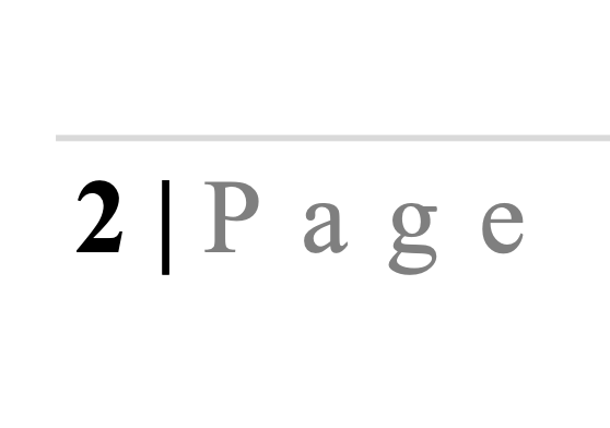
Leaving aside how bizarre it is to write ‘2 | Page’ instead of the standard English ‘Page 2’, there is no reason to use the faded grey (which may be harder to see) to achieve…well, what effect exactly? Meanwhile, the bottom rule is so thin that many readers will struggle even to see it. Worst of all, the lowercase ‘age’ in ‘Page’ is letter-spaced. Goudy rightly said that the man who would letter-space lowercase would steal sheep; that is not a good position for one of HM judges to be in!
First, not firstly
Para 23 begins as thus (emphasis added):
Having identified 30 years as the appropriate initial start point for the minimum term, there are several aggravating factors to be considered in this case. First, this was an attack by you that was extensively planned and premeditated: there was a significant degree of planning over a lengthy period.
This is a simple agreement problem. The antecedent is ‘several aggravating factors’, and therefore a list of these factors should be an ordinal list of things, beginning with ‘First’. The adverbial ‘Firstly’ is simply wrong, because the factor is the first factor listed, not the ‘firstly’ factor (which does not make sense).
A nice sentence
It may be missing a comma (between ‘features’ and ‘in’), but nonetheless the powerful thrust of the sentence beginning para 24 is praiseworthy:
In terms of mitigating features in this case there are none.
Can or will?
Para 27 reads in its entirety (emphasis added):
As the statutory surcharge applies in this case the appropriate order will apply and can be drawn up.
If a statute requires something, then surely the appropriate order will be drawn up? ‘Can’ in this instance seems to suggest a discretion, which is needless given there is obviously no question the hon. judge will perform all necessary duties, etc.
The signature block
There are some mild issues with the signature block. The hon. judge lists, following His Honour’s esteemed title as Record of London, the name and style ‘His Honour Judge Mark Lucraft KC’. This is by no means wrong—it after all is the format of the name used in no less than the Gazette notice appointing His Honour to be Recorder of London! Notice ID 3551701, 17 April 2010. However, except where there is ambiguity, such as multiple judges surnamed ‘Lucraft’ (which is not the case), there is a stylistic preference evident in the practice of the law reports and judiciary to refer to judges in the High Court style ([title] + [surname]). HHJ Lucraft KC is thus, it is submitted, preferable, but this is a matter of stylistic consistency and subjective taste rather than absolutes, and I repeat there is nothing wrong with this format of signature.
The point of consistency occurs again with the date in the signature block, which is written as ‘February 1st 2023’, and is thus the only date in the entire sentencing remarks to be written in the old style (still used in America) of month-day organisation. This is a mistake–if one writes all other dates one way, there is no reason to write the date the opposite way on just one occasion. Finally, there is no reason to write, as the hon. judge does, ‘LONDON’ in all capitals. It is unsightly and needless, as is the one comma in the signature block (after ‘Central Criminal Court’). Trust the reader will know that the line termination functions for the comma, and that London is a place and not part of the street address.
The most bizarre feature of the sentencing remarks is that there are a series of thanks to the police and to an interpreter after the signature block. The intent is probably to simply divide the sentencing remarks to make clear that these are obiter and not sentencing, but the unintended outcome is these come across as unsigned or doubtful, and make it look like the signature block was misplaced. Division does not make much sense anyway, because most of sentencing remarks, except for the operative part actually imposing the penalty, is obiter anyway! Put the signature at the end, for it is nice to clearly mark the end of something. This publication certainly does so!

© , Elijah Granet, but licensed to all under the terms of Creative Commons licence CC-BY-SA 4.0
Published in the

City of Westminster
by

GRANET PRESS
LIMITED
Comments
Post a Comment
Contributions are always welcome!