
Recently, this publication considered and condemned the use of the section mark (§
) to mark paragraphs. However, left largely unaddressed was the question of using the section mark for, well, sections. This, in theory, is a very good approach, and one your correspondent regularly makes use of in longer documents (such as: to denote parts of a book chapter). However, the table of contents employed by DJ Eldergill in the recent Court of Protection case of London Borough of X v MR & Ors [2022] EWCOP 1 makes quite clear that §
is not a panacea for other shortfalls in drafting:
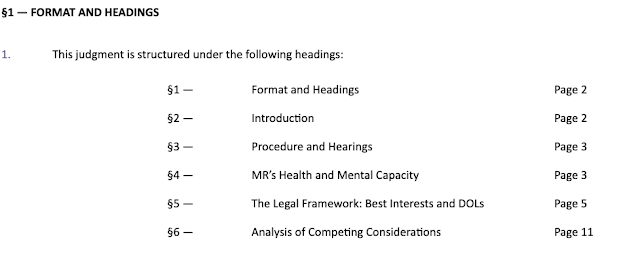 |
| The BAILII link above provides an accessible version of this image |
The Good
DJ Eldergill is to be commended for his desire to create a table of contents, and his work ensuring it was properly aligned (much like the justified paragraphs in the body of the judgment. A table of contents is essential for any structured work, both as an aid to navigation and as a signpost to the reader of how to interpret the purpose and structure of each section in the ultimate context of the thesis being advanced. It is regrettable that most judges in this jurisdiction abstain from adding a ToC to their judgments, and the willingness to innovate on the part of the judge is a praiseworthy endeavour.
The Bad
However, the table of contents falls regrettably short in several places. For a start, it lacks internal hyperlinks to other places in the document. This may not be an impediment to navigation in the PDF version, but in the HTML version on BAILII, which is likely the version most readers will encounter, these page references are useless. Internal hyperlink anchors are one of the key, format agnostic, elements that allow for easy transition between print and hypertext, and omitting them is discourteous, particularly for judgments that are unlikely to ever be reported in a bound volume or even cited in subsequent argument (as is the case for this judgment) and thus live essentially entirely in hypertext.
Tables of contents published by other courts, while not always containing hyperlinks, do at least usually make reference to paragraph numbers both online and when printed in the Law Reports. In an extended work, such as a book, page numbers are essential for a table of contents, with paragraph numbers used in the index for better pinpointing (this is taken by the Sweet & Maxwell books, inter alia). However, for a judgment, paragraph numbers are better, particularly for ease of navigation when making later citations (knowing the paragraph where a section starts allows for et seq. citations from that number for long passages). The ideal, then, is a table hyperlinked with paragraph and page numbers depending on the medium (page in the PDF, paragraph in hypertext).
Unfortuantely, this is probably beyond the ability of the word processor that the average judge is using for typing. In an ideal world, HMCTS would have a Courts Typographical Service, analagous to the successful Government Digital Service, which would consist of suitably qualified printers and typographers who would take care of this matter and leave the judiciary to worry about other things. It is trivially easy to accomplish in any number of platforms (I do something similar myself in with LuaLaTeX for most of my typography). However, in the meantime, the answer is probably (regrettably) manually setting the tables, as appears to be done for some Supreme Court and senior court judgments (I suspect and hope—though on no evidence whatsoever—by judicial assistants rather than already overworked judges). This should not prove too demanding for most judgments, which do not feature too many headings and which are unlikely to require the addition of entire new paragraphs (or deletion of old paragraphs), either of which would ruin the paragraphination, between circulation in draft and formal publication. It is not optimal, but little in legal typography ever is.
The Ugly: of sections, em-dashes, and section marks
Redundant sections
Redundancy is not always bad in law. Legal doublets and triplets (eg, cease and desist
or way, shape, or form
) are charming and legal style has been much enriched by pleasing pleonasm. Yet, redundancy is often irksome. DJ Eldergill's ToC is, regrettably, in this latter category. I have reproduced the offending part below:
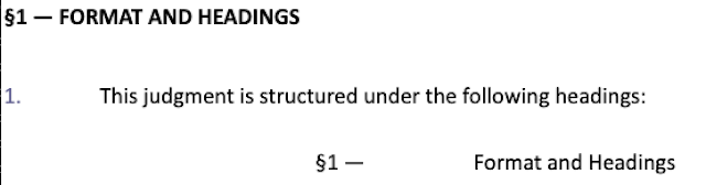
First, there is never a need to create a bespoke section for the table of contents to occupy. The ToC is a superior norm to sections; it describes and locates them, and is part of the frontmatter of a document (which is why, in proper books, it is marked with roman rather than Arabic numbered pages). It is not itself part of content, and recursive tables of contents, except where done to make computer science jokes, are terribly ugly and slightly nonsensical. The label Table of Contents
, or even merely Contents
conveys everything any reader needs to know about the succeeding list. No useful information is conveyed by this section header.
This immense silliness is compounded by a numbered paragraph which explains nothing, and slightly mocks the reader's intelligence. A table of contents does not need an explanatory sentence at the beginning, and inserting a table in the numbered paragraphs (the mainmatter of the judgment) is confusing, because the grammar of judgments naturally leads the reader to expect the first paragraph will be introductory rather than prefatory. Æsthetically, this is a disaster, and once again, no useful information is conveyed by it.
The worst part, however, is that the first line of the ToC is then a reference back to the preceding section header, meaning that the essential function of a ToC (to allow the reader to understand the forthcoming adventure and navigate it with élan) has been grotesquely reversed into a macabre, regressive instrument for taking the reader to a part of the document which she has already read. This will not do. A ToC should be a useful thing, not an upsetting thing.
Needless em-dashes
The em-dash (or, to use typographic convention, the M dash
is a supremely useful piece of punctuation. It is one of your correspondent's favourite glyphs, and is far too often underused. However, it, like any weapon in the typographic arsenal, has the potential to be used for ill. It gives no pleasure to your correspondent to so condemn a member of HM Judiciary, but DJ Eldergill's use of the em-dash in his ToC falls into this latter category.
Bringhurst teaches us that dot-fills, lines, and other such purported aids to the eye are unnecessary, for a properly led and aligned table is already entirely comprehensible to the reader. This is good advice, although in some cases (as Bringhurst himself instructs in Elements) it is better honoured in the breach. A fortiori therefore, we should look with disdain upon those lines in a ToC which do not even provide a secure sectional provenance for each page or paragaph number. The em-dash in this ToC is just such a line. It does not fully connect the number to the section title (let alone the page number); a large white expanse separates the two. Instead, it merely, at best, marks the terminus of the number, which the large white expanse already clearly did. It is punctuation for punctuation's sake, as opposed to punctuation's proper use as the musical notation illustrating text's role as speech in perfection. This will not do. Eliminate such silly marks.
Section marks: let them breathe
This final point can be dealt with briefly, because this publication has previously discussed the uses and misuses of§. When
§is used to denote sections (a perfectly coherent practice), it is essential to allow the glyph to breathe with a full space between it and the number. The simple test of replacing
§with
sshows the righteousness of this practice:
s1is plainly worse than
s 1and therefore the same should hold with
§ 1.
Comments
Post a Comment
Contributions are always welcome!