
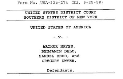
Nicklin J is an exceptionally skilled jurist who, as judge in charge of the Media & Communications List, is the foremost influence on our law of defamation, freedom of the press, and many other important areas. I had the pleasure of hearing him speak in person at an event last month, and was (as I always am with High Court judges) in awe of the sheer force of his intellect. It thus gives me no pleasure to criticise his Lordship. However, the treatment of case stylings in the recent judgment in the highly-publicised Rachel Riley and Laura Murray libel case (Riley v Murray [2021] EWHC 3437, QB) is so egregious as to demand some comment. Look below, at Exhibit 1:
![(ii) It is well-recognised that a claimant may struggle to identify, or to produce evidence from, all those to whom an article was published and in whose eyes the claimant’s reputation was damaged: Doyle -vSmith [2019] EMLR 15 [122(iv)]; Sobrinho -v- Impresa Publishing SA [2016] EMLR 12 [48]; Ames -v- Spamhaus [2015] 1 WLR 3409 [55].](https://blogger.googleusercontent.com/img/a/AVvXsEglxXqdBOwrIATIvg80q7Z7-RomE2ivbjSMTj-9ZlZHYLRPg9pOnhDV2qwmC3edJgRB4zsEgp-t3-l68X5nPB-b76H0as3_9uj7GflTZawVqKm_9niIqPl-CE9PvPqhqv6C3o3jKFkK3699dwTLaC3RRmWBOZVroWJc3bkqv3k0YYqpyIAnOV3KmaIT5Q=w640-h176) |
| Click to enlarge. This image has alt-text for accessibility. |
Count one of the indictment must necessarily be the hideous hyphens attached to our familiar friend, ‘v’, which is short for ‘versus’, but pronounced here as ‘and’. In the days of closed punctuation (still used in the USA), it would be followed by a full stop. In a few American state courts, it is horrifyingly written as ‘vs’ on official documents. However, we need not concern ourselves with such follies. The point is, the singular letter v in between two names is a perfect and universal signal that this is the title of a legal case. Equally, when an English lawyer sees a Strasbourg decision with the title Al-Skeini et autres c. Royaume-Uni, she instantly know that the letter ‘c’ in between the two names must indicate the same thing as ‘v’. There is not the slightest need for augmentation.
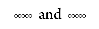
Yet, although law reports and academic works universally avoid adding hyphens to ‘v’, because it would be pointless and ugly, there is one situation where hyphens (or em-dashes and en-dashes, etc) are added routinely: in the headnotes of submissions or judgments. This, like so many bad practices that entered typography in the nineteenth and twentieth centuries, has its origins in the typewriter, when for flourish or emphasis, italic type was not at hand, and hyphens (for typewriters had no em-dashes or en-dashes) and underlines were all that there was. However, it is worth noting that in every example I have ever seen, whenever submissions or judgments were typed up by professional printers, the hyphens went away. A nice example of this typewriter practice is to be found in the image below, even though it was not written on a typewriter. The example still works because for some reason, certain American courts like submissions to be done pretending to be on a typewriter (just like with Hollywood scripts).
 |
| Click to enlarge. This image has alt-text for accessibility. |
This is a nice little tradition, and it can serve for emphasis sometimes. However, those using nothing more than hyphens and other species of dash show, I think, a lack of imagination. In my own submissions, I have played around with variations on ornaments and typographic flourishes. This is a challenge, because one cannot be too showy in formal submissions. After some debate, I settled eventually on an ornament from the Adobe Caslon Pro designed by Twombly (one of the greatest modern typographers, along with her colleague Slimbach). I am not totally satisfied, but here is a peek at my work in progress.
 | |
|
This, however, is all a distraction from the use of hyphens in running text, which is completely and utterly wrong. A covering headnote does indeed call for some degree of swashiness, but in running text, present authorities clearly, consistently, and conveniently. The italicised case text followed by a citation is all the clue we need. The hyphens add nothing, take up space, create issues for justification and line-breaks, and are against standard convention. When one departs from convention in case styling, one makes the text more difficult for the reader, and divorces it from its friends in the great volume of precedents and commentary. I can understand the impulse to make submissions more exciting, to add some spice and fire to the moribund, sexless relationship experienced jurists have with case-names, but hyphens do nothing of the sort here.
One final note must be made on Nicklin J’s use of bold and italic simultaneously for case names. This too is unnecessary and unfortunate. It is well known that typographers tend not to like bold (especially for humanist faces, though that does not apply to this judgment), as was quite a late arrival to the history of typography. The use of italic for emphasis has a very long and distinguished history, and for centuries, the idea of an italic only book (once common in the days of say, Aldus Manutius) is risible. If one is using a typeface with a proper italic (rather than simply an oblique) the difference in letter forms, thanks to italic’s connection to the calligraphic, there is simply no need to try to garnish this useful tradition with bold. It is distracting and interferes with the harmony of the page and the music of the lines.
Comments
Post a Comment
Contributions are always welcome!