
The Supreme Court's recent lamentable decision to torch its typography against evidence has already been mourned on this publication. Yet, simple despair is not sufficient. Law does not exist in isolation and we cannot try to think up best practice from first principles; instead, we must look to our neighbours. To quote Kipling, What can they know of England, who only England know?
A Typographic Tour
As good data are lacking on typographic practices are scarce, your correspondent set out a course of original research, examining the judgments of all 27 EU members' apex courts. My methodology was relatively straightforward, complicated only by the fact that most EU states have multiple apex
courts; to simplify things, I preferred (where relevant) constitutional courts' judgments, because that is the highest normative level of jurisprudence. After carefully reviewing 27 different sets of judgments (all my data may be viewed by clicking here), I can reveal the following bombshell findings.
A clear norm towards justification
My research showed that by abandoning justification, the uksc has departed from the European norm, in what I term a typographic Brexit
. Over 81% of EU member states use justifications in their top courts, with the only holdouts being Finland, Denmark, Estonia, Sweden, and the Netherlands. Justification made legal text look equally beautiful in Greek, Bulgarian, and English (in Ireland). There is, as the four-fifths majority indicates, a clear European preference for justification of court rulings.
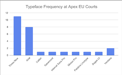
Times New Roman popular, Calibri not so much
The majority (52%) of the European courts surveyed used serif typefaces, with the modal choice was, by a large margin, Times New Roman (formerly used by the Supreme Court), followed distantly by Arial. Only Austria's Constitutional Court made use of the uksc's favoured Calibri. Special points must go to Lithuania for making use of Minion Pro. The chart below shows the full runners and riders:
 |
| Click to enlarge. See linked data for text version. |
Sans Serif and Ragged Right: distinct disfavour
The uksc's especially grating decision to combine sans-serif with a lack of justification, resembling the Asymmetric Type for which Tschichold came to repent, is exceptionally (and rightly) rare. 26 out of 27 countries surveyed used either serifs or justification (the two great tools of readability), and they were abandoned only by Finland's finlex (which may avoid using justification because it has to publish text in both Finnish and Swedish, creating linguistic difficulties not faced in the UK). The uksc has truly sought to leave Europe with its abandonment of both traditions. Even worse, it is hardly likely to find many friends outside the EU; justification and serifs are used by courts throughout the common law world as tried-and-tested methods of creating legible and accessible judgments which preserve the dignity of the Court.
Comments
Post a Comment
Contributions are always welcome!